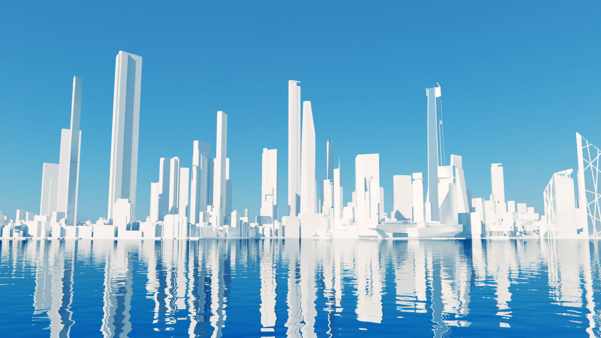
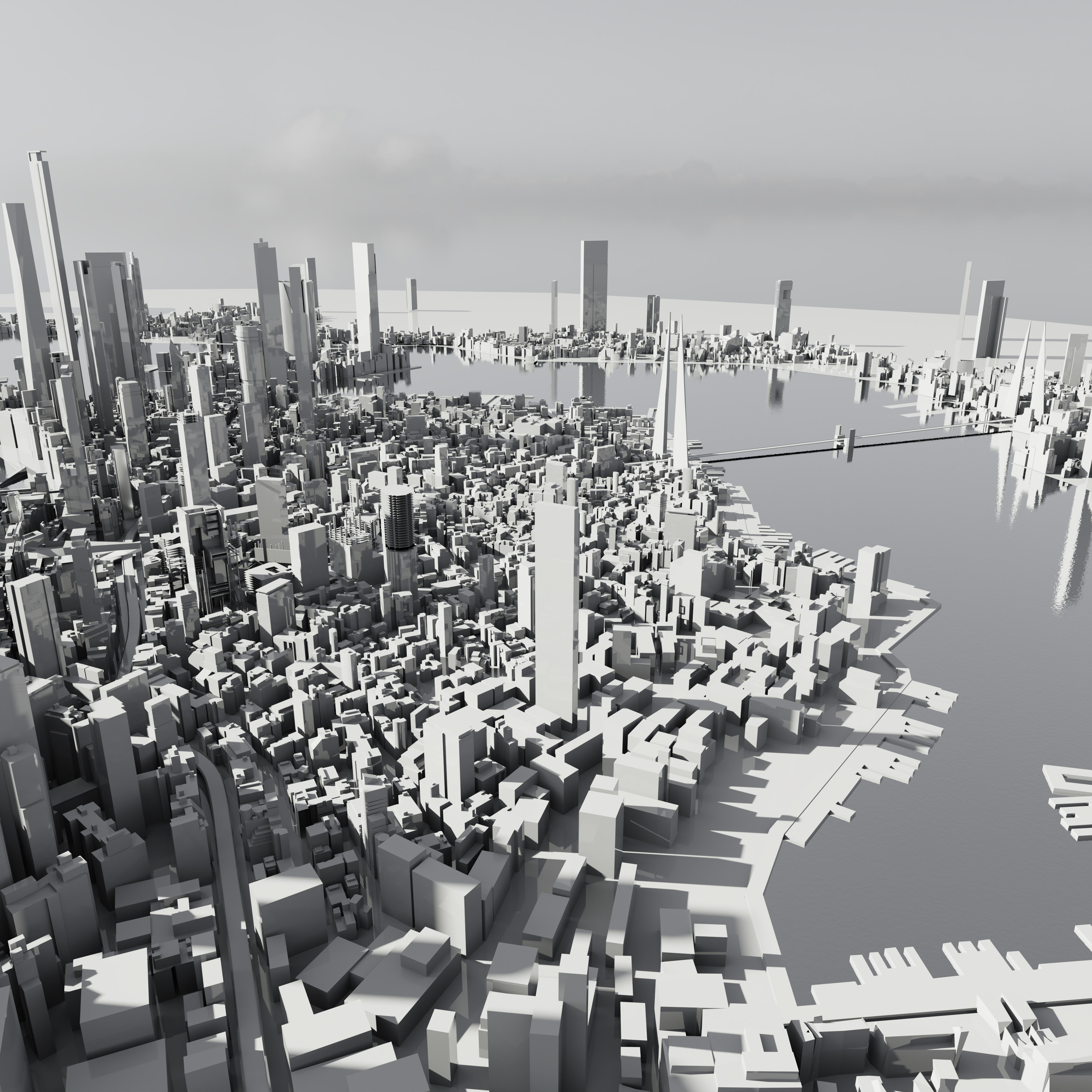
Mirror's Edge Render

My own render of the Mirror's Edge: Catalyst world in the style of Mirror's Edge's menu screen.
Mirror's Edge, released in 2008, is a truly unique video game that's still standing the test of time. Its unique lighting and simple mechanics turns this game into a stunning experience even today.
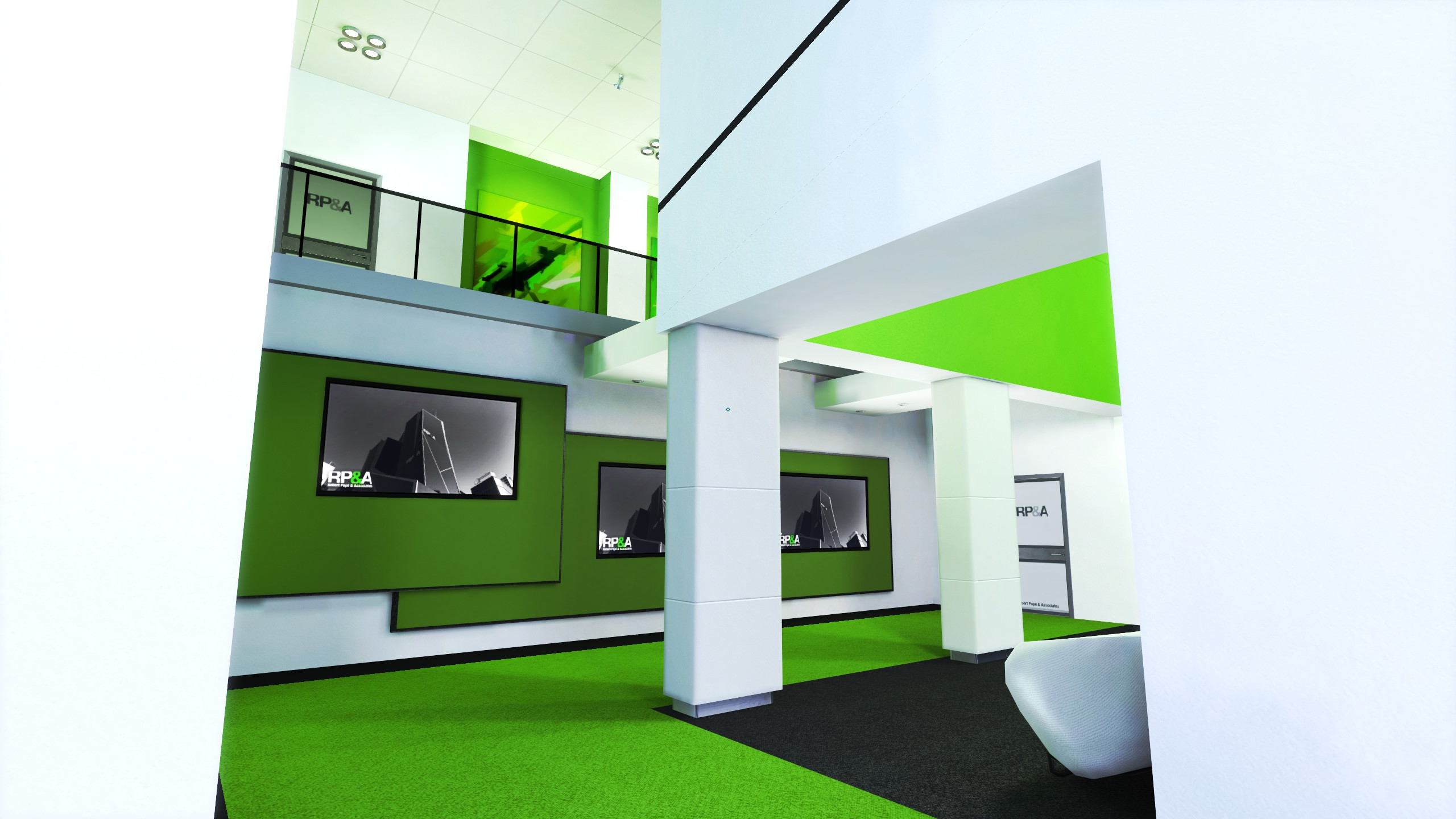
Simple architecture mixed with only tones of green.
Mirror's Edge has a special place in my heart. I fell in love with this game instantly when I discovered it when I was around 13 years old. I had a pretty bad laptop back then (think AMD APU R8 graphics) but it still ran fine and I enjoyed the game even on some pretty bad hardware. But this game also connected with me on a deeper level. During the same time, I remember other movement oriented games, mainly the few early Assassin's Creed games and specifically I Am Alive. These games inspired me to try out parkour, through which I met a lot of my then friends.
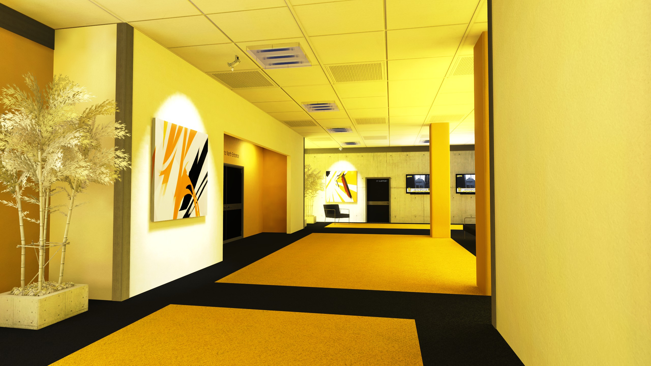
Mirror's Edge: bright primary colors, their shades and simple room designs.
The things that I remember the most about this game is its one of a kind visual style that drew me in years later to write this article. Since playing this game as a young teenager, I acquired various skills; some in graphic design, some in 3D modeling and rendering. I decided to replay this game after feeling disappointed by its successor and in order to find inspiration.
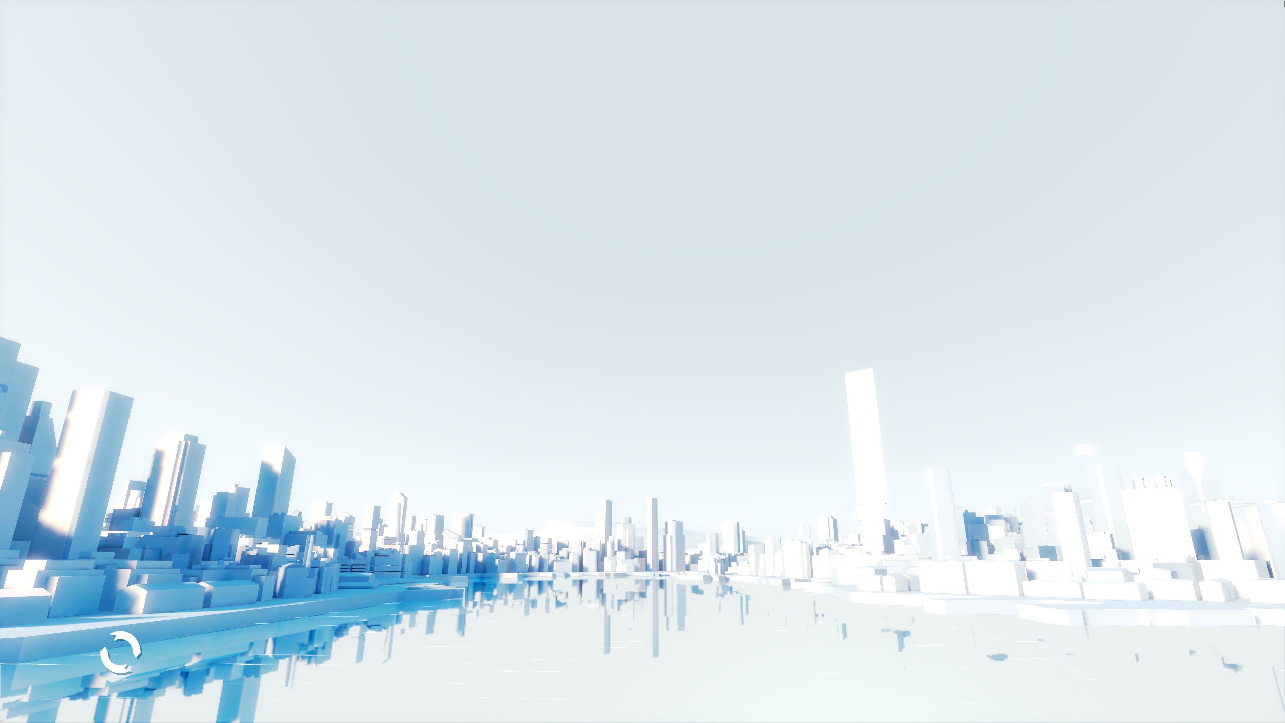
Mirror's Edge menu screen. Notice how shadows are blue, not gray.
The first thing that inspired me is the start screen depicting the City of Glass, which is what you can see was my final render. It's so serine and simple, but also has impossible stylized lighting and replicating it in Blender was very, very challenging.
My first render.
After toying around with the files I got from a user on Reddit, the first thing I tried was to slap a HRDI onto the scene and call it a day. This gave me subpar results. The composited in mist was ruining the scene. The reflections didn't take account of the mist at all. It had to be removed
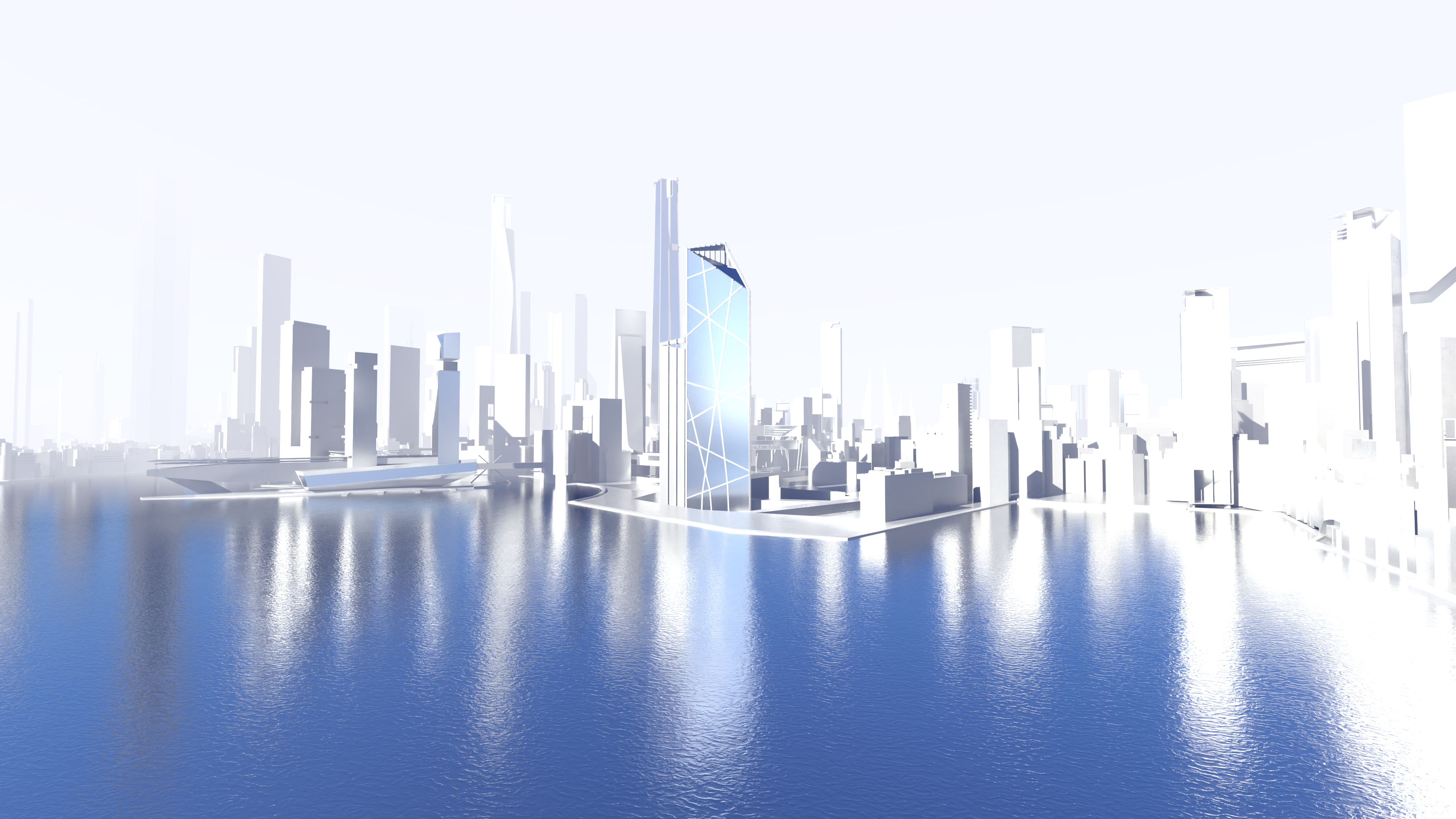
My second attempt at a render.
My second attempt seemed to be subpar to me too. The water and sky were blue, and this gave me realistic results, however, notice that this isn't present in the menu of the game. If I was trying recreate a level from Mirror's Edge, I would have been very happy, since Mirror's Edge's levels are full of a vibrant singular primary color. But here this simply won't do.
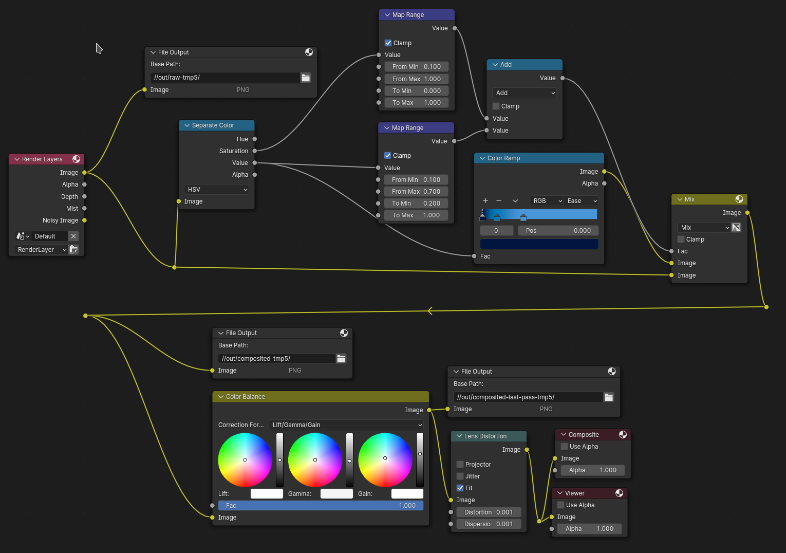
My stylistic color correction compositing process.
What transpired were several sleepless hours trying to figure out how it was even possible to make this scene to begin with. This led me to a long long period of time of learning and getting the grasp of color correction.
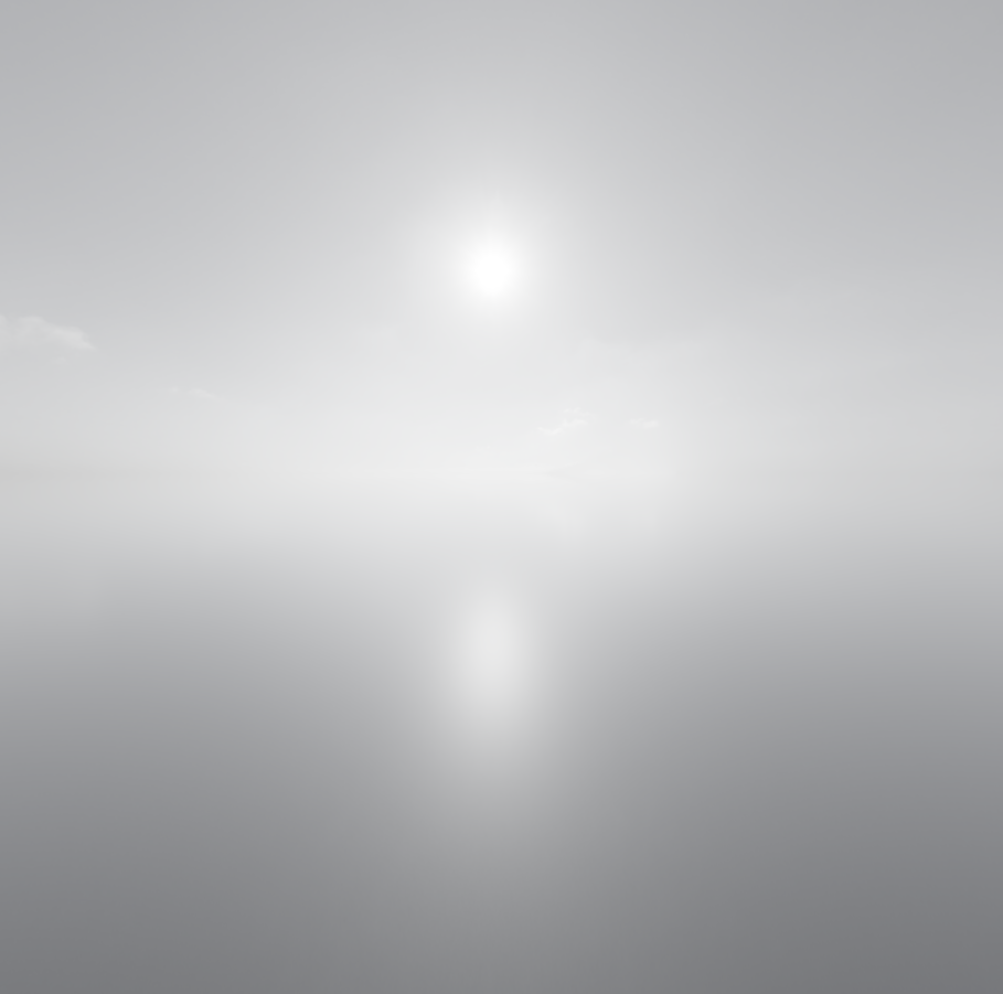
HDRI Result
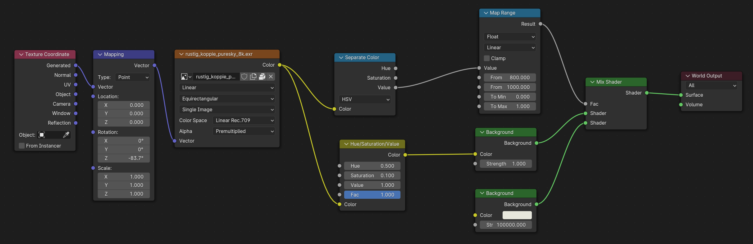
My world shader
I modified the World texture to achieve the pale white skies depicted in the menu. I also wanted to preserve the sun's shape so I isolated the sun from the rest of the image and then reconstructed it with the nodes above.
Raw Render
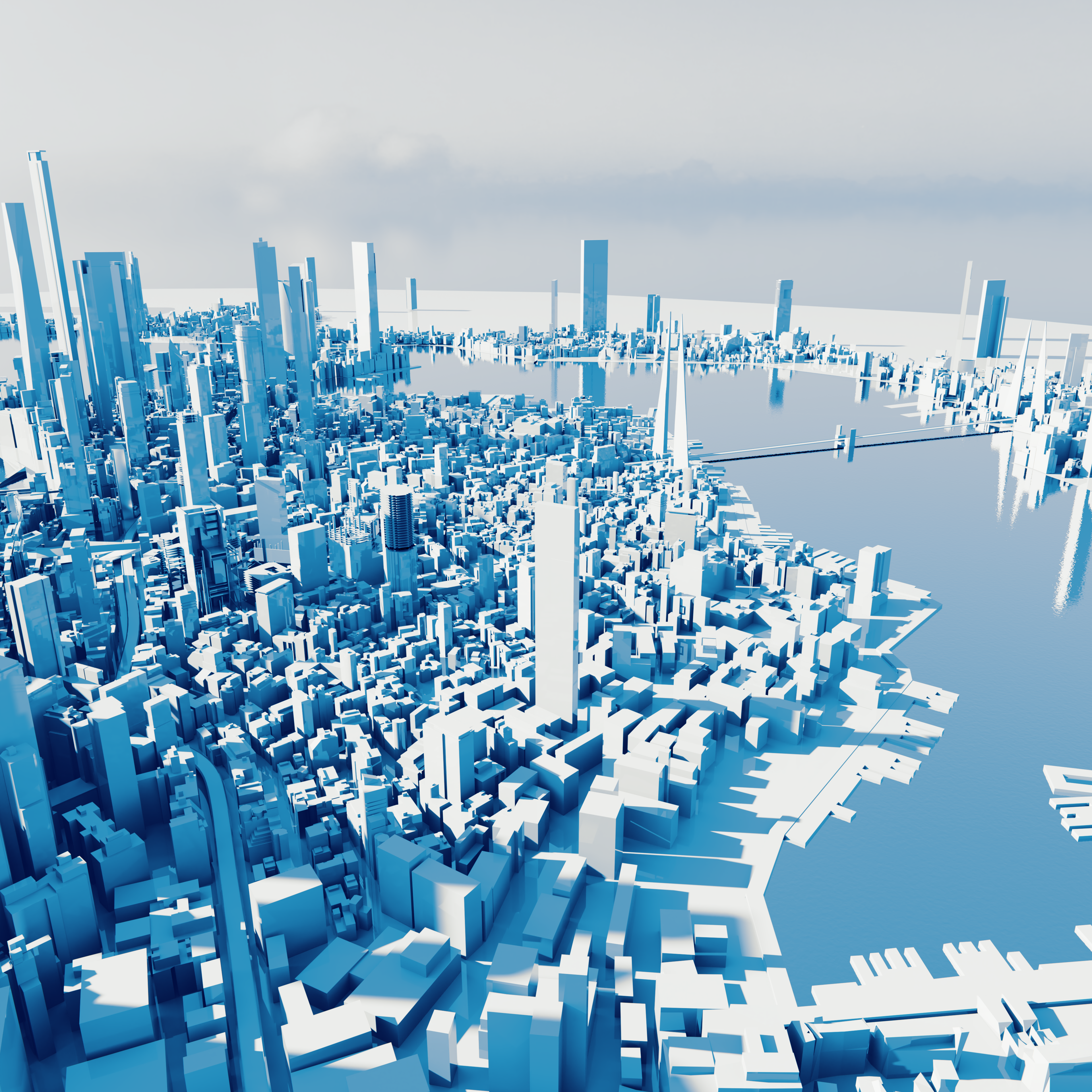
Processed Render
This combined with the compositor creates the perfect image in the style of the Mirror's Edge menu and I'm very happy with this result. I even made a little animation in the style of the main menu itself